IPCC report: six graphs that show how we’re changing the world’s climate
On Sunday the world’s top climate scientists are expected to reiterate their warning that humanity’s influence on the climate is unequivocal, with wide-ranging impacts across the planet, from rising seas to melting ice. The UN’s climate science panel, the Intergovernmental Panel on Climate Change (IPCC), is currently meeting in Copenhagen to thrash out the final wording of its so-called ‘synthesis’ report, the most comprehensive account of the state on climate science in seven years. If that sounds familiar, it’s because it is a megamix of three major reports that have already been published over the course of the last 13 months – one on the physical science of climate change, one on its impacts on ecosystems, our food supply and how we adapt, and one on the solutions, i.e. cutting emissions from our power plants, factories, cars and farms.
A draft of the synthesis report, seen by the Guardian, shows it will repeat the message that there’s no doubt over our role in global warming: “Human influence on the climate system is clear, and recent anthropogenic emissions of greenhouse gases are the highest in history,” it says.
It doesn’t mince words on the repercussions: “The atmosphere and ocean have warmed, the amounts of snow and ice have diminished, and sea level has risen.”
But there is cause for hope if governments take action, it will suggest: “Measures exist to achieve the substantial emissions reductions over the next few decades necessary to limit likely warming to 2C”. A rise of 2C is the ‘safe’ level governments have agreed to hold temperatures to.
Here are the six graphs that are at the core of the evidence collected by the IPCC on climate change and its effects:
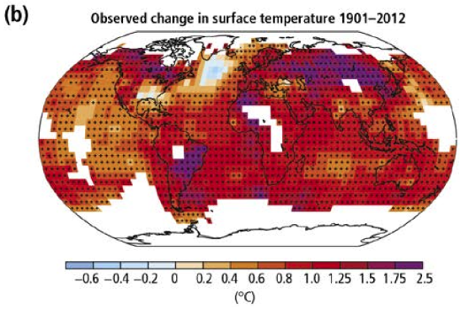
This map, from the report, shows how much hotter we’ve already made the world since 1901. It’s a handy reminder that the warming we’ve had so far isn’t evenly spread – the tropics and higher latitudes have got hotter faster than other regions:
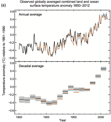
Here’s the same thing, seen another way – it shows how much temperatures have been above or below the late 20th-century average. The top one is for each year, and the bottom for each decade. Recordsshow 13 of the 14 warmest years on record occurred this century.
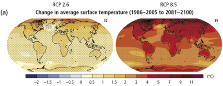
And here’s how much hotter the scientists say the planet is projected to get. The map on the left shows most places will get another degree or so of warming on top of the 0.7C we’ve already experienced globally since pre-industrial times. Unfortunately, that map assumes we’re going to dramatically cut our greenhouse gas emissions, and the map on the right is what we’re on track for given the record-breaking rate at which we’re all pumping out emissions now.
If you’re thinking a 5C rise by 2100 doesn’t sound like much, it’s worth considering that the global average temperature in the last ice age was only 4-5C colder than today:
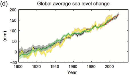
Here’s what the temperature rises we’ve seen have already done to sea level rise (as glaciers melts and water expands as it gets warmer). A few millimetres globally might not look like much but it is if you take the long view. The draft report says: “The rate of sea level rise since the mid-19th century has been larger than the mean rate during the previous two millennia.”
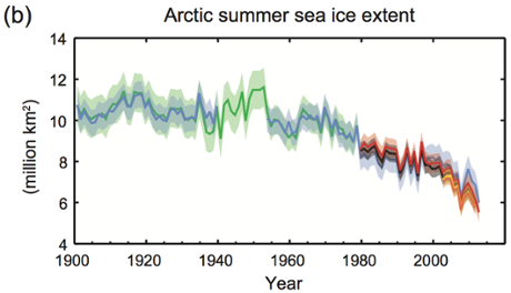
And here’s what a warming world is doing to sea ice in the Arctic, which some scientists are now linking to the more severe winters Europe and northern Asia has experienced in recent years:
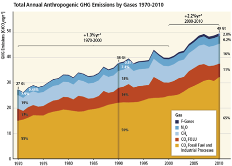
And here’s why this is all happening. We’re spitting out more emissions that ever before, and it’s getting worse. Over the past decade emissions grew at twice the rate of the previous 30 years.
Fonte: The Guardian


